|
Compliment or Collision
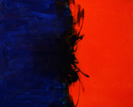
24" x 30" Acrylic Paint and Resin THE THOUGHT BEHIND THE PAINTING: While continuing to wrestle, I began thinking of the generational gaps in our culture and church. And God brought to mind complimentary colors. These are colors across from one another on the color wheel and known for making compositions vibrant and pleasing to the eye. As I thought of these colors, I realized they were totally different in their make up just as generations are. The blue is a primary color – meaning no other colors mix to make it. In contrast, orange is a secondary color – meaning two primary colors mix to make this color. In the case of orange, the primary colors red and yellow mix to create it. Then I realized that in a complimenting pair all primary colors are involved. The relationship was astounding to me. Every color working together to make something vibrant and beautiful. It then reminded me of the beauty I believe there is when we look beyond our own generations and give of ourselves and lives for others regardless of whether we are young or old. If we all meet in the middle, there can be a beautiful composition – we will compliment each other. On the other hand, if we don’t choose to be the one to make the effort, we will collide instead. HOW IT RELATES TO THIS SERIES: After wrestling and grieving the differences revealed, God showed me that He desires to use art and me personally to step into the in-betweens. HOW THE PIECE WAS MADE: First I painted blue and orange acrylic paint on a canvas. Then I mixed up resin and tinted it with two colors. One container blue and one orange. Then I poured them on the canvas meeting in the middle and then gently poured opposite colors on each side of the other. |